FITTED
Fitted is a responsive web app that motivates users into an exercise routine suiting their level, schedule, and interests.
PROJECT OVERVIEW
Problem statement
Finding exercise routines that match your level of fitness and comfort is half the battle. The other half is actually fitting it into your schedule. I wanted to create a way for users to feel comfortable finding a routine that they liked even if it meant trying something new and then making sure they made time for it.
Potential solutions
A web app that motivates users into an exercise routine that suits their level and interests by providing routines and interactive examples, and their schedule by helping them to get into a routine for physical activities in as little as a 5-minute workout.
DESIGN APPROACH
The purpose of this project was to extend my knowledge beyond UX and into UI design and understand UI design principles and techniques, to be able to tackle projects that extend across both disciplines.
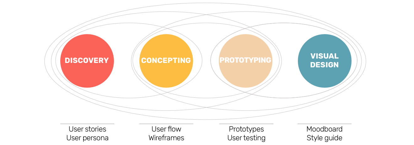
I started with exploring the composition and layout of my web app from a UI perspective. Once I solidified the foundation for my project in mid-fidelity mobile wireframes, I dived into the visual design part, exploring the visual design principles, the color, typography, icons, imagery, and interactions.
Finally, I adapted my designs for different breakpoints, since I have been taking a mobile-first approach to my responsive design, and created the polished mockups.
Discovery & Concepting
User Persona
User Flow Diagram
Based on the user stories, I drew out a user flow diagram for my web app design showing the specific actions the users must take to reach their goals, and the feature needed.
Low Fidelity Wireframes
I created low-fidelity wireframes in order to outline, in more detail, the steps already laid out in the previous user flows.
Low fidelity prototypes allow us to present, prototype, and test our ideas quickly so that we can test them as soon as possible.
Prototyping & Visual Design
Moodboards
I started by creating two different mood boards communicate the visual directions for my web app, and to present the feelings targeting the users. I end up choosing the second mood board. I felt like it was less intimidating, especially for someone who did not work out for a while and needed a more inviting interface. Orange is associated with the meaning of determination and stimulation and promotes a sense of general wellness and positive energy.
This mood board is good for both energized workouts and slow one and can be adaptable to any environment.
Interactions and Gestures
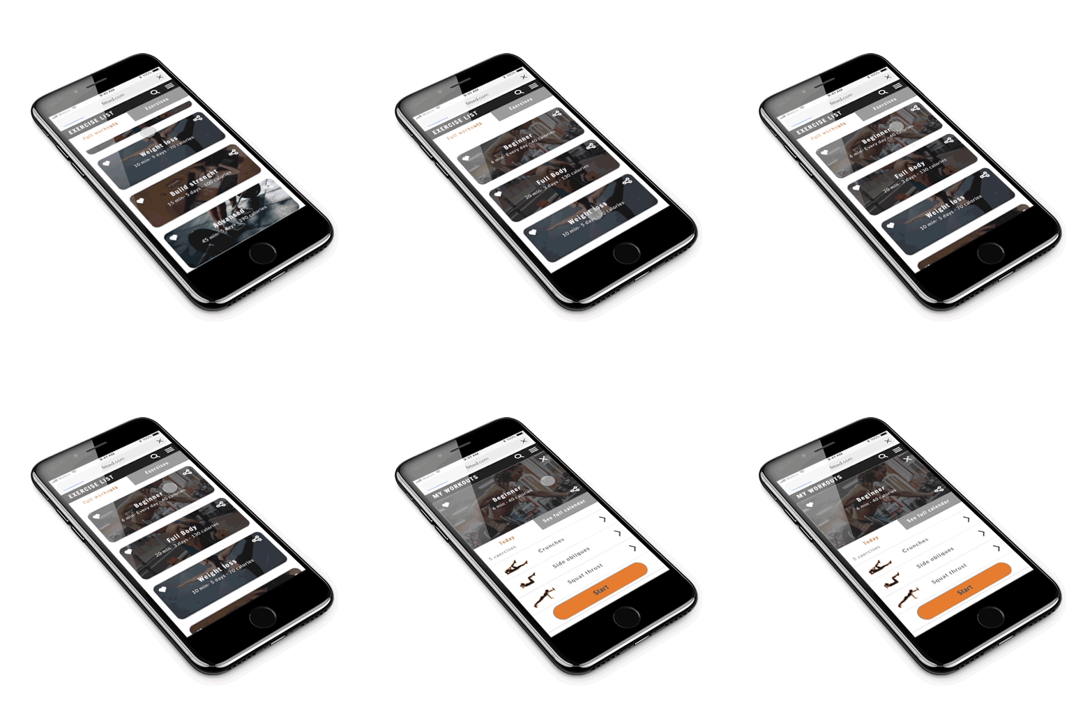
I introduced some animation to help direct and engage users as they explore our web app.
Style Guide
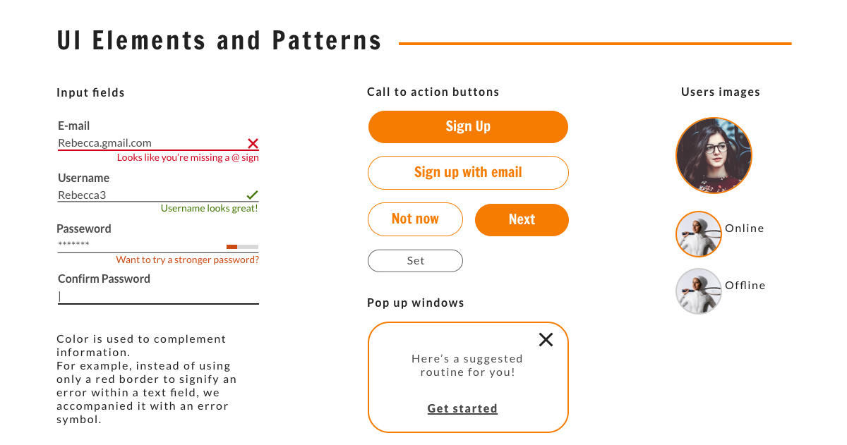
I created a Style guide describing the visual design components and UI elements of my web app. The goal of the style guide is to maintain a consistent brand look and feel across all the screens. It can also serve as a guideline for other professionals who may be working on this project in the future.
I created the icons starting from simple geometric shapes, to keep the simple aesthetic of our web app and to ensure readability and clarity of each icon even in small sizes.
Hight Fidelity Mockups
You can find our app’s clickable prototype bellow.
Designing for different breakpoints
For this project, I have taken a mobile-first approach, by designing for a mobile breakpoint and then adapting content for larger breakpoints. This approach is based on the principle that designing for smaller breakpoints is hard, and should, therefore, be done first. I also followed the principles of progressive enhancement for a simple, minimal, and usable design.


